Template Design
by Joy-Vincent Niemantsverdriet
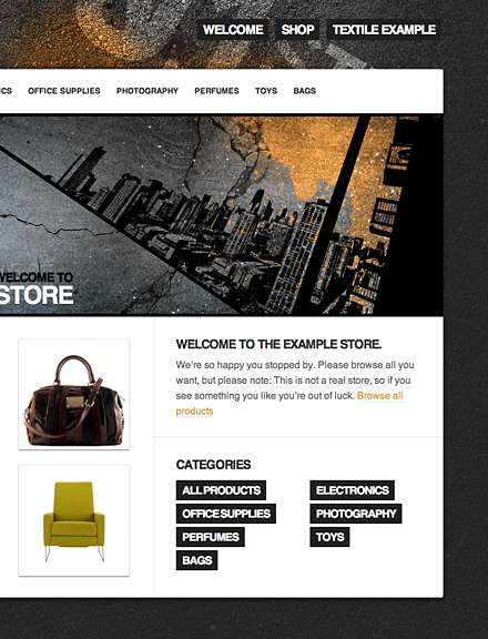
When we first released Enstore, we designed some store templates to get you started with a great-looking store and today we're adding two more: Hawaii and Asphalt. We've learned a lot creating our default templates, in this post we share some do's and don'ts for when you're designing a template for your store.
The way a template is designed has a lot of influence on the shopping experience of a customer. First impressions are really important, because a badly designed template will cause your customers to lose interest, and more importantly their trust in your store. At the end of the day, the more they enjoy shopping at your store, the more money you're going to make.
Customization
By customizing a template you can add more personality to your store to increase your store's value.
You don't need a lot of HTML knowledge to customize your store, because you can customize a template in different ways. For example, the Asphalt and Hawaii templates both have a welcome page that contains a header image. You can simply edit the image in Photoshop and add custom graphics like branding or images of featured products.
If you know your way around HTML and CSS, you have the ability to include cool additions such as headers, ads or maybe even videos. You could even go further and create your own template from scratch.
Menus
When you are designing your layout, it's important that you use the space wisely. The product menu is one of the main elements that influences your layout. To know how much space your product menu is going to take, you should first take a look at the number of categories you are going to have.
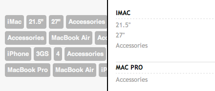
In a horizontal menu with a fixed width, it's sometimes difficult to get all your menu items onto a single line. In which case, you have the option to decrease the font size, or continue the menu on the next line. In templates like Bishop and Mocca both the top and submenu items are shown side-by-side. This is one way to use a horizontal menu, but it's probably not best to use it for a store with many menu items.
To keep a menu with lots of items free of clutter, we advise that you use a vertical menu. This makes use of the vertical space and makes it easy to scroll. More often than not, you should put such long menus on the left. Most users are accustomed to reading from left to right and therefore often start at the left side of a page.
Cart
To make purchasing products as pleasant as possible, it's important that you prevent every possible source of frustration for the customer. Searching for the cart can be a prime source of frustration. Therefore, it's important that the cart is always placed in an obvious location. On many of our templates you'll see that the cart is located at the top of the sidebar. The Bishop and Mocca templates don't have a sidebar, so we chose to give them a horizontal cart beneath the menu.
 The horizontal cart of Mocca. On top the collapsed view and at the bottom the edit view.
Besides the location of the cart, it's also important that it has a neat and clean appearance. Products with long names often don't fit in a sidebar with a fixed width. For the Bishop and Mocca templates we list the products horizontally and if there's too many, we use more lines. This allowed us to use larger fonts and add detailed information. You could also create a nice placeholder when the cart is empty. For inspiration, both Hawaii and Asphalt have placeholders.
Buttons
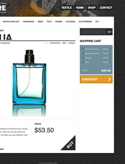 Elements with different shapes or colors scream for attention.
To successfully sell products, customers must know where to click and where they can pay. So when you have these important actions you need to draw attention to them.
It's better to create 'checkout' and 'buy' buttons that stand out from the rest. We also advocate that you give them a specific color that helps to stand out. The shape of a button can also make a difference. For example, the 'buy' button on the Asphalt template is the only element with a triangular shape. To draw attention to important buttons it is wise to minimize the number of unnecessary buttons on each page. Buttons also need to have a "down-state" so it's really obvious when they are clicked.
Providing feedback
We advise you to give the customer a response on important actions. By giving a response, you reassure the customer that what they expect has been carried out. For example, each time a user clicks on a "buy" button they need to know the product has been added without having to constantly check the cart. To properly inform the user, templates like Asphalt and Hawaii have a small notification popup that flashes whenever the cart is busy.
Different States
To let your store shine at all times, it's important that you look at all the different states your pages can be in.
The information that comes with a product determines how to present it on a page. For example, if a product doesn't contain an image or a description, it creates an empty gap on your page. For this you could create a placeholder for the image, or create a layout that doesn't necessarily need images, like the Nihilists template.
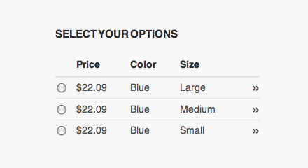
Products may also contain different variations. Variations are presented within a table that automatically appears when you look at a product in detail. When you design your template it is important that you don't forget this element, because it has no default styling.
Get the Most Out of Enstore
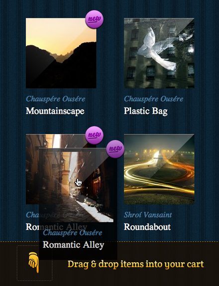 The interactive cart of Tripwire makes use of drag and drop.
You can also add features to enhance the shopping experience for your customers. With Enstore you can make use of jQuery, a javascript library that makes it easy for you to add interesting features such as drag and drop. You can see an example on the Tripwire template, where you can drag products in to your cart.
Please be careful while adding javascript effects and heavy imagery to your store. While these additions might seem cool in the beginning, they can be an easy annoyance for your customers. For example, having a 500px high illustration at the top of your store would have to make your customers scroll every time they land on a page. Making it hard for them to easily browse your products.
Tips to Keep in Mind
- You can change the style of an empty cart.
- You need a page when searches return no results.
- Pagination controls need styling.
- Use the truncate filter for lines that get to long.
- If you don't have a logo, use a substitute in the form of text.
- You can add special design elements to your featured products.
Let us Know
If you have questions about designing templates or about templates in general, please visit Enstore Support.
We are aways looking for interesting stores on Enstore and we love hearing about them. If you've created a great store, designed your own template or when you have ideas for future templates, please let us know.
Where to Begin
If you are interested in starting a store, visit Enstore and create a store for free. You can also find out more on how to design a template with Enstore Designer in the Enstore Documentation.
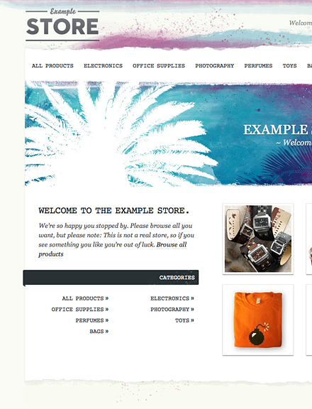
 On the left the menu of