Georgia on My Mind
by Jorn van Dijk
In the last eight months I've been working on redesigning – or realigning – our company site.
This turned out to be quite a challenge because we wanted to maintain our original identity, while improving a lot of specific elements.
Creating your own online presence is a tough job. When you're both client and designer, the highest standards apply. It has to be top notch, unique and inspiring on every level. But working on your own site is also incredibly interesting and educational. I'll get into specifics soon, but first I'd like to talk about where we started and why we ended up with the site you're looking at right now.
Way Back
When Sofa started in late 2006 our message to the web was brief and simple. We were five people with two products, so it only took one page to explain the who and what. The design was as straightforward as the message.
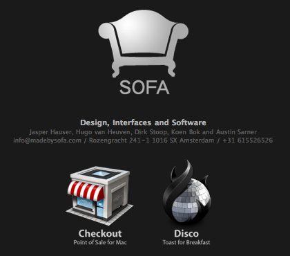 The first version of the Sofa site from 2006.
By mid-2007, we realized we needed more. Sofa was growing; we announced Versions and hired more people (that's me). Adding another icon to our current page could have been a quick fix, but we also wanted to share a bit more of our vision on design and interaction. Plus, our satisfaction with the first site had slowly evaporated over time. We wanted to try something fresh. Thus, revision number 2.
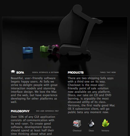 The second version of the Sofa site from 2007.
To see these ancient sites live, check out the links below. Try not to flinch, they call it the Wayback Machine for a reason.
Identity
In early 2008 we realized that the second version of the site lacked some crucial elements. It didn't mention our icon and interface design work. More importantly, it did a poor job showcasing our software. We wanted more space to write about our team and philosophy. And we were ready to start a company blog. Everything considered, it was time for a new site. A place on the web that said: “This is Sofa”.
Inspiration
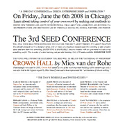
We still liked the simplicity of our single-page designs. But also needed a more complex site given the refined content. With that in mind, our search for Sofa's identity started. On the one hand we really liked simple and elegant vintage poster design from the 70's. On the other hand we were heavily inspired by clean and minimalist web typography.
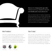 A Photoshop mockup that draws inspiration from that poster.
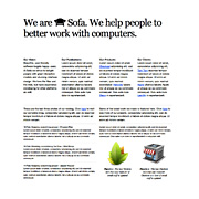 A mockup in HTML that draws inspiration from the Seed site.
This is where it got interesting. After playing around with both styles, we started to sketch out interaction models that would let us disclose content gradually.
The home page should feel and read like an ad with a super clean look, but behave like a web app. Everyone liked this angle, where we would try to merge print design with the possibilities of the web. This visual process got a boost when we set “We are Sofa” in large type on top of the page.
Type
Because typography played a key role, I started to design directly in HTML and CSS, instead of creating a mockup in Photoshop first. While this approach was new for me, it was necessary. Type renders awkwardly in Photoshop and looking at it in the browser makes all the difference. To further enhance the feel of a carefully tailored page, we decided to go with a fluid layout. When you resize your browser the content of the main site scales with you from 920 up to 1200 pixels. This way it looks tight on both laptop screens and on bigger displays. Figuring out how to do this on every browser was quite demanding. But all this effort was worth it when we proudly launched our new home on the web late 2008.
“At first this looks like a flat, text-based Web site, but the way the interface opens up when you click on the lower boxes is simply beautiful. Typography is finally being used as effectively on the Web as it is in print.”
Realign
After a year, the cracks in my design started to show. It also made sense to change the site's message. Because we were all working full-time on our software now, it was time to put less emphasis on our design services. But I also became dissatisfied with a lot of other components.
- Our software page had a rather boring layout, with little room for links and images. It should talk more about the functionality of our apps, less about creating them.
- The design page needed to loosen up. A lot of artwork had to be scaled down to fit the 2008 design. It didn't showcase our efforts to get everything pixel-perfect.
- The company page's four-column layout made it difficult to add new content such as jobs, awards and links.
- The blog was a total disaster. When I initially designed it, keeping everything on one page seemed like the way to go. But a fluid layout is tough to maintain when the content varies as much as it does on a blog. It also desperately needed a better interaction model.
Conceptually, the site was still spot on Sofa. But there were so many critical elements in need of improvement that it felt like going back to square one.
Side by Side
After another eight (!) months I'm proud to present the results. And this is what this post is all about, so let's dig into the specifics of this redesign.
Looking at the homepage, the execution felt a little loose. The key-visual was rendered again with different settings which resulted in a cleaner look. The font size for body text in the old site felt a bit cramped and there was too much content in the navigation blocks. After correcting that and setting the margins again, the homepage felt subtle and clean.
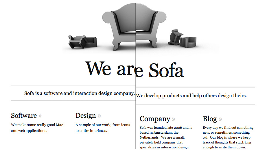 The new homepage on the left, the old one on the right.
Software
The software page contained a lot of text and only one image of each application icon, nothing more. The copy itself wasn't very to the point; it focussed too much on background information. We also lacked space for additional links. To top things off, having the text flow over two columns resulted in some awkward reading situations.
 Versions on the old software page.
The new software page is a lot cleaner. There's a small gallery with images of each application's interface, icons and site. The copy is more down-to-earth and centered around the functionality of the application. And we finally had room for those additional links. Having just one textual column works a lot better in the fluid layout. It scales up and down quite nicely when you resize the browser window.
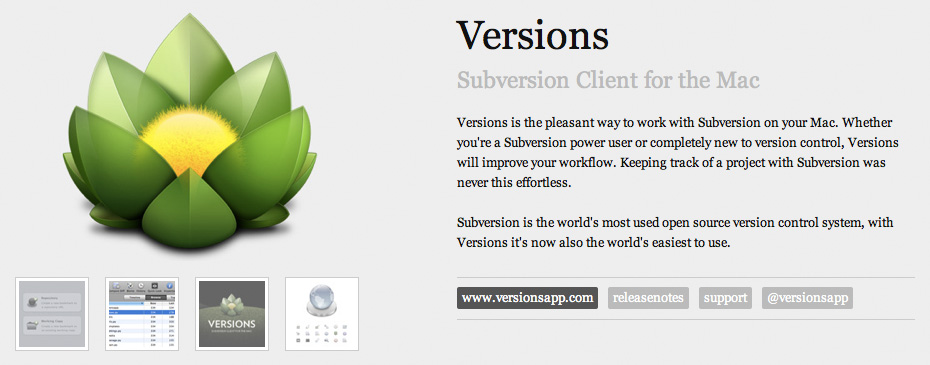 Versions on the new software page.
Design
In the initial version of the design page, I stuck too close to the three column layout. The lack of variety made the page look dull. Another downside was that I had to scale down all our precious pixel-perfect artwork. Not pretty at all. The page was also messy: various icons, sites and projects were loosely grouped. More images required more clicks, which resulted in people missing a lot of the work. Content-wise, there was simply too much talk about stuff that wasn't all that important.
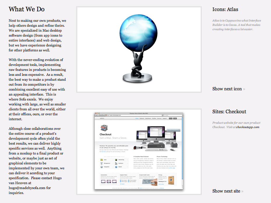 A portion of the old design page.
The new design page has a client centered approach and sports various layouts to make the page more interesting. All the images are right there without any buttons hiding more artwork. Bigger illustrations flow outside of the content boxes or are cut off on the top or side to create a more playful page design.
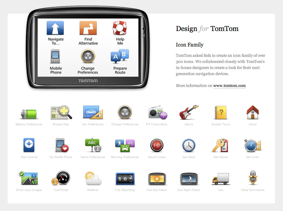 TomTom is one of the many clients on the design page.
Company
The old company page looks cramped. A lot of text on a small canvas. Our pictures feel tiny and the matching copy is hard to read. The lack of color on this page makes it look bland, while the opposite is needed.
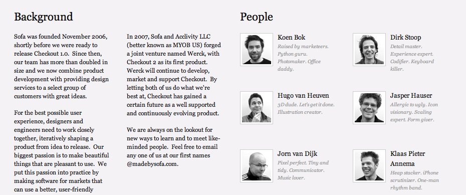 The old company page.
The new company page has a two column layout. That way, the content scales vertically, which makes it more convenient to add content. The employee profiles are slightly bigger, with room for full sentences and additional mail and Twitter links. The profile pictures animate from black and white to full color on hover and add extra character to the people on this page.
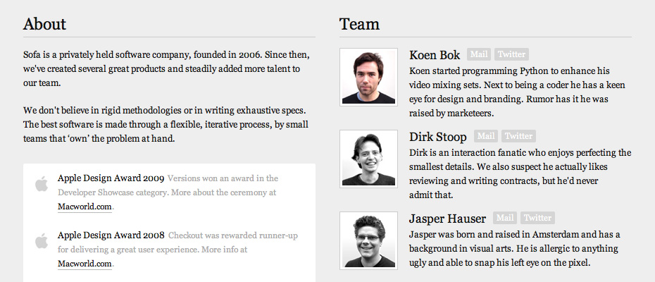 The new company page.
Blog
The old blog was integrated straight into the site. At the time, this seemed like the right way to go. But with a great variety of content, it wasn't exactly easy to maintain. Images for example were hard to get right. The fluid layout would cut bigger illustration off awkwardly while smaller images had too much white space around them. Having the navigation and content in one place was nice but simply didn't work out. The most important argument for wanting to change the interaction model was that Google couldn't index our blog posts as the content was fetched with Ajax.
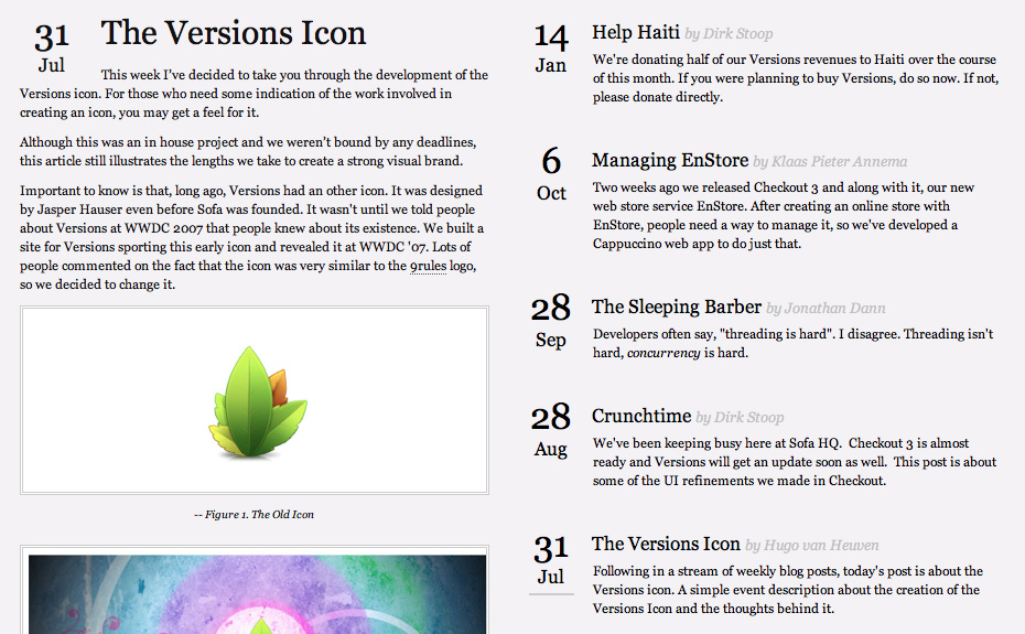 The old blog was integrated in the site.
The new blog page only displays the blog navigation. Actual blog posts are displayed on a separate page (which you are looking at now). This new interaction model solves 2 major problems. Google can now index the post content because it is no longer loaded with Ajax. Secondly, the blog has a fixed layout instead of fluid. This creates more fixed boundaries for a great variety of content and is therefore easier to maintain.
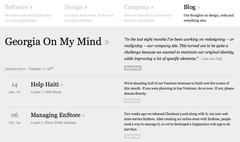 The new blog page shows a list of articles, with the actual post on a separate page.
New Tone
We also took the opportunity to look at what we said and how we said it. The copy on the old site was lengthy and a little off-topic. The new site is more descriptive in a more clear and casual tone. Instead of “striving to delight people with solid interaction models” we now simply “make some really good Mac applications”. Combined with the larger font-size we hope that people will actually read what we have to say.
Fin
Back to where I started. Creating your online presence is a tough job, no doubt. For me, that job boils down to iteration. While the iterative process from the last eight months felt tiresome at times, it's exactly what brought this site to a whole new level. And the efforts that went into this redesign didn't only lead to a new site. I've also learned more about web typography, grid design and fluid layouts.
Let's hope this design stands the test of time, and the need for another round of design takes at least another year. For now, I hope you enjoy the new look and feel of the site!
The old site is live right here if you want to have a close look at what changed. Enjoy spotting the differences.
Thanks to Dirk Stoop for his help and edits on this post. More thanks go out to Wilson Miner, Brandon Walkin and Christopher Liscio for their help with grammar and flow. An elegant vintage
  A typograhic and clean site for the