Crunchtime
by Dirk Stoop
We've been keeping busy here at Sofa HQ. Checkout 3 is almost ready and Versions will get an update soon as well. This post is about some of the UI refinements we made in Checkout.
We've been keeping busy here at Sofa HQ. Checkout 3 is almost ready and Versions will get an update soon as well, although most of the credit for that goes to João. This post is about some of the UI refinements we made in Checkout.
Jorn already lifted the tip of the veil in his post about Checkout's new welcome window. Naturally, that's only one of the more obvious changes in the new release. Checkout 3 will ship with a bunch of new features like product matrices (think sizes and colors for shirts), label printing and a great new way to set up a webstore. All things our customers have been asking for, and that we have been meaning to add to Checkout for a while.
Today I won't talk about those big new features, we'll save that for when the app is released and you can take a closer look at them. Instead, I'll talk about some improvements that are a lot smaller in scope, but just as interesting to talk about from a design point of view.
Whenever you make a visual design, you secretly hope it will stand the test of time, but as long as you keep getting better at what you do, you'll find something about it that you want to improve at some point. When I first looked at Checkout 1's interface after we shipped Checkout 2, this piece of work that we were all so very proud of suddenly felt surprisingly quaint. The same thing has started to happen to Checkout 2's interface during the many spit-and-polish cycles we've applied to Checkout 3.
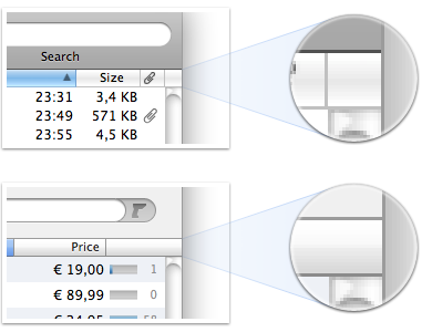
Table headers are one of those things we have wanted to ‘fix’ for a long time, but somehow never got around to earlier. By default, table views in Cocoa apps show a little separator on the right-hand side of every column header, even in the rightmost one when there's a scrollbar under it. It has always bugged me to no end that in this situation, that rightmost 1px gray line – which, by the way, is completely unneeded – is exactly one pixel off to the left compared to the scrollbar drawn below it.
 Normal table headers at the top, courtesy of Mail.app, Checkout 3's table headers below.
Fixing this took more work than it should, it turned out to be pretty tricky to figure out exactly what state a header is in (normal, selected, depressed, showing an ascending or descending sort indicator) when you write your own drawing code from scratch. The upside was that once we did the groundwork to figure all of this out, we could fix everything that bugged us about regular table headers at once, like those blurry sorting arrows, and the awkward, glassy look that afaik. hasn't been updated since Mac OS X Public Beta.
This kind of sounds like we knew what we were doing from the start, but it proved quite tricky to improve upon a standard Cocoa control that's used so much (Checkout has *a lot* of table views), without making it look out of place in the rest of the app or the larger environment. Lets just say that it took many iterations before we had something we were all happy with. Another illustration of how hard it is to replace common controls like these: We also tried to come up with a better look for the standard scrollbars in Checkout, but failed to find something that didn't feel ‘un-Mac-like’. Basically, everything we came up with worked less well than the standard scrollbars, because they just didn't feel as ‘scrolly’.
Besides visual improvements like the one described above and workflow improvements that are above and beyond the amount of time I've given myself to write this post, we're also introducing some pretty interesting new UI concepts in Checkout.
Two big recurring themes in the interaction with Checkout are: Search is really really important, and people are going to be using barcode scanners with the app. Most barcode scanners emulate keyboards, so when you scan a barcode with them, a stream of characters is put wherever your keyboard focus tends to be. If your keyboard focus happens to be in a spot that doesn't allow input, that stream of characters translates into a stream of beeps. In other words, not very useful, unless you select the right spot to scan into first. This lack of being smart about where the barcode should go often results in the following scenario:
- Scan barcode
- Hear beeps
- Put the barcode scanner down
- Grab the mouse
- Aim and click in the right spot
- Pick up the barcode scanner
- Try again
That sounds completely unnecessary, doesn't it? Sadly, it's kind of tricky to discern between characters coming from a barcode scanner and a real keyboard, especially after Leopard introduced a new security measure that made it impossible to completely intercept and redirect all events coming from a particular keyboard (or for that matter, a barcode scanner). Understandable measure, but it meant a bunch of extra work for us.
If you develop Mac software, you are probably familiar with the concepts “first responder” and “responder chain”. In short, the first responder is the object in your app that will get the first shot at trying to handle an event (e.g. a keyboard event) that is sent through the app, the responder chain in turn is used to find the first object in the whole app that is able to handle any particular event if that first one can't deal with it. Checkout 3 now has a special ‘first barcode responder’ and every object that supports being the first barcode responder has a little indicator that animates in when it gets that special status. Basically this indicator is a barcode cursor, which can move independently from the text insertion point cursor. A scanned-in barcode always goes to the object that is showing that cursor.
Now, on to search, because the two are related as we'll see later. We wanted to offer people a way to refine their searches in Checkout, without adding unneeded clutter and complexity to the UI. All of Checkout's search fields are used for live, full-text, type-ahead search (or in other words, the way search works in iTunes, but not in the iTunes Store). In several places we've added options to search only for matches on a particular type of data, e.g. searching for products by brand or customers by address, instead of searching for matches on any type of data related to a product or customer.
We started with looking at how other apps solve this problem and the biggest issue we saw with just about every solution is that they were all a tad too minimalist for our tastes. The best solution we spotted is showing a little icon in a pop-down control to the left of the search field. The icon visualizes what criterium you're searching on, clicking the icon reveals a menu that lets you pick another. While I like the idea of using a pop-down menu here, it seems dangerous to assume someone will remember what that little icon stands for when they don't get the search results they expect. Using icons without labels is always tricky. And in this particular case, an icon sitting next to a search field to me doesn't say: “Hey, we're only giving you matches for this particular type of data now.”. It doesn't explain enough and is too easy to glance over.
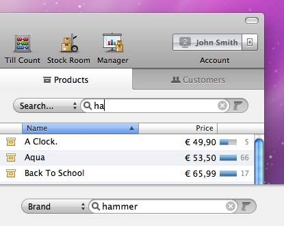
There's also a little bit of extra room next to the searchfields in Checkout. Thanks to that luxury, we could run with a more obvious design. So without further ado, let me present to you: our completely tricked-out search field.
 Checkout 3's tricked-out search field.
The search field in these screenshots is dressed up with both the ‘barcode cursor’ (which lights up briefly when a barcode is received) and our new search criteria chooser. If you look closely you'll see that we also had to redesign the border around the search field – most visibly at the bottom line with its single pixel white drop-shadow – to make this heavily accessorized version look good.
These are just a couple of my favorite new things in Checkout 3, and I could talk a lot longer about them than I just did, so I'm stopping myself here. We're getting very close to the release, so it really is crunchtime. Be sure to download the Checkout 3 demo when it's out (we're aiming for mid-September) to discover all the little new things we've made in it. We would love to hear what you think.