Welcome Window
by Jorn van Dijk
A sneak peek at Checkout's upcoming welcome window design.
Checkout 3 is in the making and we are updating a lot of its behavior and user interface design. One of the views that desperately needed a re-design was the welcome window. As a point of sale application Checkout is maturing. The upcoming release contains a lot of requested features and will be more powerful and flexible then ever before. The current welcome window doesn't convey that message to our users. Here's a little behind the scene information on what we're trying to do.
Growing Up
As a product Checkout is targeted at small and local stores around the world. People that sell books, jeans or furniture. You can connect multiple terminals over a local network to each other but it isn't targeted at, let's say, Walmart. Our clients usually own small and unique stores. With the new version coming up we are taking the application to a new level. We are adding much requested features like label printing, matrix products, quicker sales and much more. Next to those technical improvements, our users are using this product every day and the current visual user interface design felt outdated. One of the elements that defines where your product stands in the market is the welcome window. It's the first impression of your product and can help the user understand what to expect or do with the app. We do our best to keep Checkout as simple and easy to use as possible but it still has a learning curve. The welcome window helps the user understand what to do next.
Current Implementation
The current version of Checkout has a very basic welcome window. Its functionality breaks down to experimenting with the example store, creating a new store, watching Quicktours and buying or registering the application. Functionality wise it's pretty solid but visually it doesn't do the new app any justice.
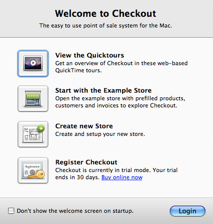 Checkout's previous welcome window (version 2).
Research
My design process usually starts with doing research. I look at solutions from competitors, other indie developers or Apple. Also, when I try out software or while browsing the web I make screenshots of interface elements that I like (LittleSnapper is perfect for that). Here are two sources that were important for the new design.
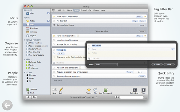 Things from Cultured Code has a beautiful welcome window. It's split up in 2 sections. The first section allows you to Purchase or Enter the License Code to unlock. The second section, gives you a brief overview of the main layout. It tells the user what to expect which is very user friendly in my opinion.
Keynote from Apple is the perfect example of what we were looking for. The welcome window focusses on learning. Checkout is a point of sale which obviously has a learning curve,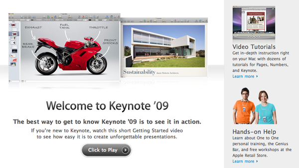 and this is exactly were our users should start. We have in-depth videos online for people to watch so that they get familiar with the product. Keynote's welcome screen does a good job inviting the user to watch such a video. Other then that, Keynote's welcome screen doesn't do a lot more. It focusses on learning, and learning alone.
Design
The previous implementation of the welcome window contains important behavior towards our users. It doesn't just sell the application, it also let's you experiment with the example store, create a new store, getting in touch with the helpdesk and logging in. All that functionality needed to find a more natural look and feel. Finally, here's the design.
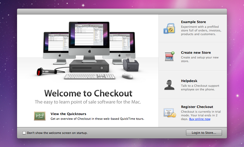
We also looked into behavior. While the welcome windows from Things and Keynote do a great job, they are there for a limited time. Checkout is different in this. A lot of our customers use the welcome window on a daily base. Before purchasing our app, people play around in the example store or create their own store. Obviously, you have the option to hide the welcome window on launch. But a lot of our users don't do this. The welcome window kinda is the cornerstone of starting their day of work with Checkout.
Redesigning such a key element of Checkout's first impression is interesting. We are hoping to achieve a more mature look and feel while not giving away anything on the behavior. I'm looking forward to your feedback in whether we succeed in this or not. Drop me a line on jorn@madebysofa.com.
For more examples of welcome windows, have a look at this page on Ember (the online equivalent of LittleSnapper).