Gameboards and GUIs
by Cathy Shive
Can a graphical user interface be like a gameboard?
Can a graphical user interface be like a gameboard? I don't mean to suggest that it might be possible for users to play an application the way they would play a board game. That would be weird and counter-productive. But, if we put aside the obvious differences between games and applications, is there something we can learn about interface design from gameboards?
This question has been in the back of my mind since I read Katie Salen and Eric Zimmerman's excellent game design book, Rules of Play‚ specifically a short section where they talk about the function of the gameboard in the popular children's game, Chutes and Ladders.
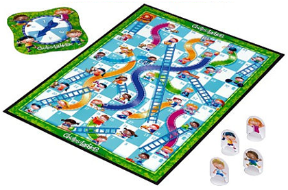
In case you haven't played Chutes and Ladders, the rules are pretty simple. Players take turns advancing their tokens a random number of steps. They start at 0 and the first player to reach 100 wins. As a player moves forward, they might land on a number with an associated ‘chute’ or ‘ladder’, at which point they either have to move backwards a certain number or steps or they get to jump ahead.
Salen and Zimmerman point out that the game could be played out on a couple of sheets of paper instead of on the gameboard. You'd need one sheet of paper to keep score and another as a cross reference for the ‘chute’ and ‘ladder’ numbers. However, the experience of the game would become much more complex, especially for children in the target age group (ages 3-7) who might not be able to do the math necessary to keep score.
So it's not just the underlying, or constitutive, rules that make Chutes and Ladders a successful game, it's very much to do with what the gameboard adds to the experience of playing:
The use of the gameboard in the process of generating a random number, recording progress, and seeing whether or not your token climbs or slides, helps emphasize the meaning of the game in a number of ways:
- The board contains all aspects of the game information, progress towards the end space as well as climbing and sliding‚ at once.
- The representations of the players (their tokens) are all in the same “space”, making comparison of relative positions immediate and intuitive.
- Players can clearly see the consequences of their actions, whether it is moving normally during a turn, climbing, or sliding.
Wow, Chutes and Ladders has a great interface.
Workflows and Overview
I asked Jasper Hauser what he thought about the comparison of gameboards and GUIs and he made the observation that the important thing to get from the text, in terms of interface design, is the concept of an overview of a workflow. He's absolutely right. The board gives players a high-level, visual overview of the game's ‘workflow’ and their position within it. The result is that players are able to understand the game's state and to predict how their actions will effect their progress in the game–with a single glance.
This is extremely powerful, but is this amount of overview something that graphical user interfaces can benefit from or strive to achieve? I think so. Until recently, it's been acceptable to just throw every feature of an application onto the screen at once and to let users access anything at any time. This is how older applications like Photoshop, After Effects and Final Cut Pro were designed. While functional, these types of designs have two major downsides: they tend to be overwhelming to new users and it can take years to become productive with the application. This is the opposite of what a lot of us are trying to accomplish with our interface designs.
More recently, with UI design trending towards a single-window approach and especially with the iPhone, we're seeing more thought being put into designing workflows. The experience of navigating and working inside of a prescribed workflow has become a critical factor to the success of an interface design. If the workflow of an application is fairly logical and easy to navigate, the software might be described as "intuitive" or to have "ease of use". On the other hand, if a user feels stuck or lost too often, they probably won't use the software again. Workflow and navigation design is a tricky business. I'd go so far as to say that it is the hardest problem to solve in a modern interface design. But, it's becoming more and more unavoidable.
I won't get into the topic of designing workflows, but assuming that an application has one, the issue of providing an overview and how that can help a user to understand, navigate and act within the workflow, becomes very relevant. The more our designs can clue them in, the better their experience will be. This is where gameboards can help.
Let's take look at the points Salen and Zimmerman make about the Chutes and Ladders gameboard again. I would like to adjust them a little to suit our purposes by summarizing and by replacing the word “gameboard” with “interface” and “player” with “user”:
- The interface provides a high-level overview of the entire workflow of the application.
- Users can immediately and intuitively see where they are in the workflow in relation to where they've been and where they might go.
- Users can clearly see how their actions move them through the workflow.
It's not perfect, but looking at these points, there are at least two things I know we can do to achieve (even if just a fraction of) what the gameboard achieves: The visualization of hierarchy and focus.
Hierarchy and Focus
It's unlikely that an interface can display its entire workflow all at once, but it can still provide an overview of the workflow through the layout of its hierarchy. ‘Hierarchy’ refers to the organization of an application's workflow as hierarchical groups of sub-workflows. In a document-based application, for example, the highest-level of the workflow is the application itself. Launching and quitting the app and creating new documents are part of this scope of the hierarchy. Inside of that, users navigate between documents and inside of that, they navigate and work with the actual content of the application.
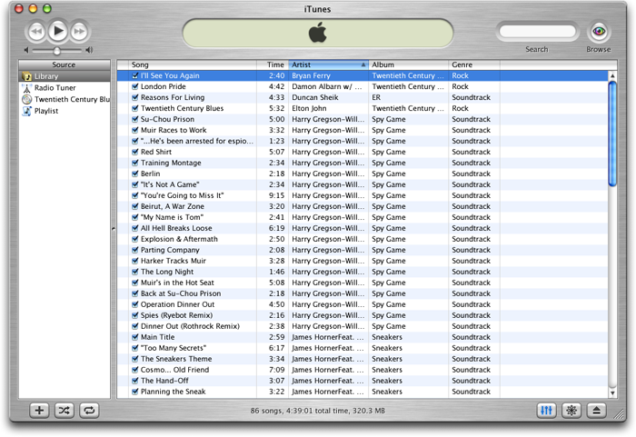 Remember this? The early iTunes window is the first example of strong visualization of hierarchy and focus that I can remember. I knew how to use this application immediately.
The better our interfaces can visualize the hierarchy of our application in its layout, the more information we are giving users about the workflow, which helps to make the interface easier and more enjoyable to use.
There are some rules-of-thumb we can use to lay out a hierarchy so that it provides a strong overview of the application's workflow. In general, the workflow should be organized in a nested layout that starts with the most important, or global, entities at the top, left parts of the window. These outer layers enclose more context-specific, sub-workflows, which get laid out towards the lower, right parts of the window.
The deeper we get into the hierarchy, the more likely it is that entire modules of the interface will get switched out with other modules. Even though we might not be able visualize the entire workflow at once, we can use visual tricks, like animation, to help users build a mental map of the workflow as they navigate it.
The consistent and logical layout of an application's hierarchy, along with a few visual tricks can provide users with a strong overview of the workflow–even the parts of it that aren't visible. The next step is to add real-time feedback about the user's activity. This can be accomplished by strong visualization of focus.
Visualizing focus includes having well designed selection highlights, a consistent color-scheme for visualizing a view's ‘key’ status and the use of focus rings to show navigation through sub-workflows. The visualization of focus gives users information about their position in the workflow and how they got there. This, combined with a good layout will hep them guess where they might go next.
Monopoly, anyone?
As more modern apps take a single-window interface approach, solving this problem of how to provide a good real-time overview of a structured workflow is going to become more and more important to solve. It’s not easy and, unfortunately, there are few precedents to look towards for guidance. Maybe we should start playing more board games?